A place for English speaking sofrim (scribes), magihim (examiners), rabbis and vendors of Stam (Torah, Tefillin and Mezuzah scrolls) from around the world to communicate, share ideas, ask questions and offer support and advice.
Hi R. Moshe, This Mem has two major problems. 1) The Moshav is like a ZANAV and 2) The MEM is greatly separated from the VAV with the connector descending to the bottom of the CHARTUM.
In both cases however, it appears to me that, we do not have the halakhic basis to invalidate it. Instead, the VAV part should be thickened a bit and the MOSHAV should be squared.
My reasoning with respect to the VAV is that we are lenient in the case of a GIMMEL where the left foot connects to the right foot near or at the top of the roof. Here we have the same thing with respect to the CHARTUM of the MEM where on one side (at least) it definitely connects at the middle. Thickening the VAV a bit would definitely remedy this situation.
With respect to the MOSHAV being written as a ZANAV, whe are lenient when it comes to a LAMED. Likewise, whe should accept that here, the KHAF part maintains its TZURAH. However, we should square it at the bottom in order to improve its shape.
In response to what R Attia wrote, if one looks at the MEM above the one in question, it seems that the tikkun proposed by R Attia had already been done. When enlarging the photo it seems as though there is a white space in between the "old VAV" and the alleged tikkun. it also looks like the ink in this place is a little different. Could be that it is an illusion... maybe not.
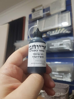
I recently tried this kosher ink for my rapidograph and I am extremely pleased with it. It does not clog the nib like other kosher rapidograph inks, and it's very dark and strong. It's at least as good as the Rotring commercial grade rapidograph inks (of course these can only be used with batch numbers that have been lab tested and approved kosher), and in addition you do not need to add a drop of regular Sta"m ink (as per the instruction of the Shevet Halevi, which is messy and time consuming). I was wondering if anyone else had an opinion or comments with regards to their experience with this ink...
We all know that there is no ancient source that requires ink to be מן המותר בפיך . Possibly, as said here before, because in the olden days ink was always מן המותר בפיך and the question was never raised. It was probably self-evident. Nowadays, no decent Rav will approve an ink which is not מן המותר בפיך . Who was the first one to raise this question? Was it raised because of animal ingredients or because of non-kosher wine?
In today’s day and age, virtually every kosher product available to the consumer comes with a hechsher. By hechsher, I mean an official and recognised rabbinical body or agency that certifies the kashrus of a product, be it a food item or a religious article. Hechsherim play a vital role in providing consumer confidence, and something branded by a reputable kashrus agency will be considered more legitimate than a similar product that does not. The agency has rigid policies and protocols in place to ensure correct standards are met, and they are independent of the manufacturer so that there is no conflict of interest. As we have discussed on this forum previously, there is a distinct lack of official hechsherim on Sta”m products - Tefillin, Mezuzos and Sifrei Torah. Even the Vaad Mishmeres Sta”m, the oldest and most well- known rabbinic agency in the Sta”m world does not certify products. They test and ordain sofrim and magihim (examiners), offer a computer checking service (sp...

Hi R. Moshe,
ReplyDeleteThis Mem has two major problems. 1) The Moshav is like a ZANAV and 2) The MEM is greatly separated from the VAV with the connector descending to the bottom of the CHARTUM.
In both cases however, it appears to me that, we do not have the halakhic basis to invalidate it. Instead, the VAV part should be thickened a bit and the MOSHAV should be squared.
My reasoning with respect to the VAV is that we are lenient in the case of a GIMMEL where the left foot connects to the right foot near or at the top of the roof. Here we have the same thing with respect to the CHARTUM of the MEM where on one side (at least) it definitely connects at the middle. Thickening the VAV a bit would definitely remedy this situation.
With respect to the MOSHAV being written as a ZANAV, whe are lenient when it comes to a LAMED. Likewise, whe should accept that here, the KHAF part maintains its TZURAH. However, we should square it at the bottom in order to improve its shape.
In response to what R Attia wrote, if one looks at the MEM above the one in question, it seems that the tikkun proposed by R Attia had already been done. When enlarging the photo it seems as though there is a white space in between the "old VAV" and the alleged tikkun. it also looks like the ink in this place is a little different. Could be that it is an illusion... maybe not.
Delete