
דיוחנן - kosher rapidograph ink.... Experiences or comments pls
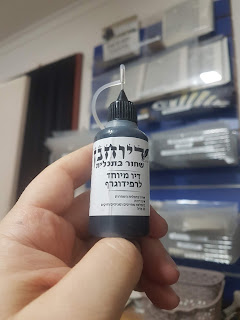
I recently tried this kosher ink for my rapidograph and I am extremely pleased with it. It does not clog the nib like other kosher rapidograph inks, and it's very dark and strong. It's at least as good as the Rotring commercial grade rapidograph inks (of course these can only be used with batch numbers that have been lab tested and approved kosher), and in addition you do not need to add a drop of regular Sta"m ink (as per the instruction of the Shevet Halevi, which is messy and time consuming). I was wondering if anyone else had an opinion or comments with regards to their experience with this ink...
Yes ideally should have space but not sure if it needs correcting
ReplyDeleteThe "Hei" should be LARGE and written separate from the Shem. This is the consensus of our Gedolei Yisrael. Please see Minchat Shai, Ramah (R. Meir ha-Levy ben Todros Abulafia), and the Keter Aram Zovah.
ReplyDeleteIn order to correct it, the left edge of the "Hei" may be scraped slightly in order to reduce its width and separate it from the Shem.
The Yemenite Mesorah has no space after the ה, but seeing as this is not a Teimani Sefer Torah it should and can be corrected.
ReplyDeleteThe back of the lamed as well can be erased and rewritten further away from the hei.
ReplyDeletewould seem like the lamed is a better option since its slightly stretched anyway
Delete